Research paper: The great rise in wealth for those with low incomes
Udgivet d.
28. januar 2018 - 15:13
English
Research paper: The great rise in wealth for those with low incomes
Summary
Using data from Denmark, persons with low incomes in 1987 saw the largest rise in income out of all income groups through 2015. The same is true of persons with low incomes in 1994 and 2004. The annual rise in income for those with low incomes are greater in recent periods.
This result contradicts the popular claim in public debate that advances in wealth benefit primarily or exclusively those who are already wealthy, while those with low incomes see essentially no benefits. This claim rests upon a tradition of analyzing income developments over time by looking at the development within a particular income bracket. However, this approach says nothing about the income developments experienced by actual individuals, since few people remain in the same bracket over many years.
Three out of ten people who are in the bottom 20 pct. of earners in any given year are already out of that income bracket a year later. The proportion of those who can expect to be among the top 20 pct. of earners for at least one year of their lives is likely over 80 pct.
What should interest us if we are concerned about income mobility, is whether or not individuals with low income increase their earnings over time. This is largely the case (see figure 1).

In the public debate, it is often claimed that advances in wealth benefit primarily or exclusively those who are already high earners, while those with low incomes see little or no benefits. For example, The Economic Council of the Labour Movement (ECLM) writes in an analysis[1] from 2016 concerning income trends since 1994: “The actual incomes of the 10 pct. poorest have risen by only 10 pct. in this period, and after 2007, incomes have fallen for the 10 pct. poorest”.
If we examine the development of individual citizens’ disposable income across different periods of time, however, we see a different picture (see figure 1).

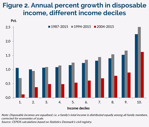
The figure shows the annual growth in disposable income for the 1987–2015, 1994–2015, and 2004–2015 periods for population groups, divided into deciles according to income, in the three respective starting years.[2] For example, the blue bar in the first column shows the average rise in income for the 1987–2015 period for those who were among the 10 pct. with least disposable income in 1987 (and who were still alive and resident in Denmark in 2015).
Persons with the lowest income in the start year achieve the highest growth in disposable income in all three periods. The figure also shows that the annual rise in income among those with the lowest incomes is not lower in later periods; quite the opposite.
When studying income distribution, there is no tradition among researchers of analysing income trends over time for specific cohorts (i.e. groups of people), as it is done in this analysis. Instead, conclusions like those in figure 2, below, are often presented. The income trends for concrete individuals are not tracked here. Instead, the figure shows how disposable income has changed for a given income decile over the same three periods.

If income development is presented in this way, the opposite picture emerges; that is: the greatest proportional rise in income is enjoyed by the highest income deciles. As professor emeritus Eric Jørgen Hansen wrote in a newspaper commentary[3] : “The elite has experienced an increased in wealth, while a significant proportion of people, particularly the 20 pct. lowest earners, must now recognize that their economic distance to the elite is growing larger and larger.”
Which of these pictures is the most accurate?
The first conclusion (figure 1) looks at average income developments for concrete individuals who were in a particular income decile in a given starting year (1987, 1994, or 2004). Those with low incomes in those three starting years had, on average, a greater rise in income compared to those with high incomes in the start years. Many of those in the lowest income deciles are, for example, young people who are studying or who have little work experience, and therefore earn less. In the course of their careers, most of these people will develop their skills and earn higher wages. They will thus move up through the income deciles.
Others have low earnings because they are temporarily unemployed or receiving welfare. Fortunately, most unemployed people do not stay unemployed for long, so their disposable income increases. Still, others have high earnings at each of the three starting points. These are typically experienced workers. Some of them will experience a reduction in disposable income during this period, e.g. because they will retire. These people will move down through the income deciles.
The second conclusion (figure 2) does not follow concrete individuals’ income developments, but as previously stated, shows how the disposable income for a given income decile has changed over the three periods. It is an approach like this that has led professor Erik Jørgen Hansen to conclude that the 20 pct. lowest earners are moving farther and farther away from the highest earners.
Mobility in income is high
The problem is that this says nothing about the income developments experienced by people themselves, since few people remain in the same bracket over many years.
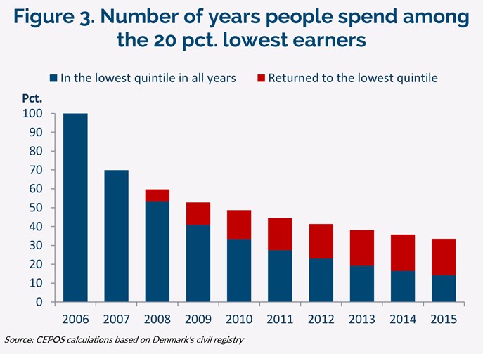
This is illustrated in figures 3 and 4 on the next page. Figure 3 shows how long people in the bottom fifth in 2006 stayed in this group, which represents the 20 pct. of the population with the lowest incomes.

As shown, three out of ten have already left this group after a year. After five years, less than 50 pct. remain in this group, and only 30 pct. remain there for all five years.
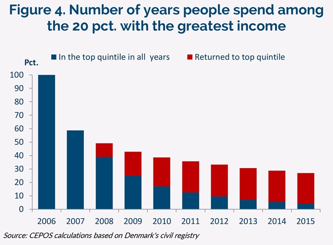
Figure 4 shows how quickly people leave the highest income quintile; that is, the 20 pct. with the greatest disposable income.

The figure shows that more than 40 pct. leave this group already in the second year. After three years, only about a quarter have remained in the group all three years, and after five years, only 13 pct. have remained in the group the entire time. An additional 23 pct. have returned to this group after one or more years of absence.
It would be relevant to examine the share of the population that will be has been part of the 20 pct. top earners at some point in their lives. But since 1987 is the first year for which we have consistent data, there is no period for which we have data that is also long enough to do proper calculations based on actual lifetime incomes.
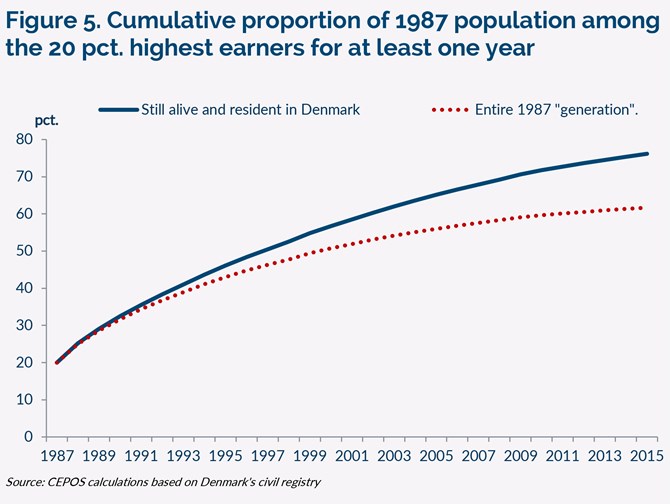
Instead, we use a calculation where we take the cumulative proportion of the 1987 population who were among the top 20 pct. of earners for at least one year. This calculation can serve as an illustration of how many citizens at some point in their lives will be among the top 20 pct. in terms of income.
Results are shown in figure 5.

In the starting year, 1987, we have (obviously) exactly 20 pct. among the 20 pct. top earners in one or more years. The year after, 1988, 25 pct. had been in the top 20 pct. in either 1987 or 1988. As early as three years later, this proportion had risen to 32 pct. From this point, we obtain different results depending on the method we use. If we consider those who are still alive and still resident in Denmark (the top/blue curve), the proportion of top 20 pct. earners for one or more years rises to 76 pct. of the population in 2015. If we instead consider the entire 1987 population (the bottom/red curve), the proportion of those in the top 20 pct. of earners for one or more years is 62 pct. by 2015.
There are arguments to be made for and against both methods. The blue curve tends to overestimate the proportion in recent years. This is due to the fact that individuals with relatively low incomes are overrepresented among those who have died or left the country, who are subsequently omitted from the calculations. Conversely, the red curve underestimates the proportion, since a number of individuals had already been in the top 20 pct. before 1987 but will not rise to that position again. This includes, for example, those who retired in 1987. The correct proportion of the population that has reached the top 20 pct. of earners after a given number of years is thus somewhere between these two curves—that is, between 62 pct. and 76 pct. for this 28-year period. Over a lifetime, this proportion will be even higher. CEPOS’s lifetime income model indicates that the proportion of individuals who can expect to be among the 20 pct. top earners for at least one year in their lives is likely over 80 pct.[4] .
Conclusion: Focus on concrete individuals’ income trends
If we are interested in in whether or not people with low incomes have good chances of improving their own living situations, purely in economic terms, we ought to focus on whether or not individuals with low incomes experience a rise in their incomes. This is largely the case.
In a society with high income mobility, it is conversely less interesting whether or not the lowest wages rise at the same right as the highest. This is because individuals who start their careers at low wages typically receive better-paying jobs rather quickly.
With regard to the level of starting pay, different considerations conflict with one another. Low starting pay means that individuals receiving this pay have low disposable incomes and, by extension, little material wealth. This would appear to favour higher starting pay. But a labour market with high entry-level pay is, in turn, less inclusive than a labour market with low starting pay. High starting pay can make it difficult for those with few qualifications to enter the market and build their qualifications through experience, whereby their pay will increase. This is because such a labour market will have few entry level jobs suited for workers with low labour productivity.
In a society with high income mobility, it may therefore be more important that those outside the labour market find employment, and thereby have access to pay raises justified by work experience, as opposed to simply having high entry-level pay. Higher starting pay risks leaving a greater proportion of the population unable to enter the labour market and accrue the kind of experience that leads to pay raises. Among groups that are at risk of exclusion from the labour market due to high starting pay are young people with little work experience, unskilled workers, certain individuals with mental illnesses, certain handicapped individuals, refugees and immigrants.
Fodnoter
-
- ”Danmark på fattigdomskurs”, Labour Movement Economic Council, 2016- see it here.
-
- The reasons behind the choice of these three starting years are as follows: 1987 is the earliest year we have data for; after 1994, inequality in Denmark began to rise; 2004 is 10 years after 1994. Selecting other starting years gives the same results.
-
- Velfærdsstaten er sin egen fjende”, Berlingske April 16th 2017 – se it here
-
- Here, the starting point is a lifetime income model that generates entire “lifetimes” using statistical matches. A similar model is often used by the Ministry of Finance to calculate inequality in lifetime incomes.
Top 1 pct. mest formuende betaler 8 pct. af alle skatter og afgifter
I dette notat ser vi nærmere på, hvor meget de 1 pct. mest formuende betaler i personrelaterede skatter og afgifter.
Kommunal omfordeling i Danmark 2011-2024
I 2024 var det borgerne i en lille gruppe kommuner – hvor de fleste er placeret i hovedstadsområdet – der trak ”velfærdslæsset” for den øvrige del af landet. Denne tendens er blevet mere udtalt i perioden fra 2011 til 2024.
